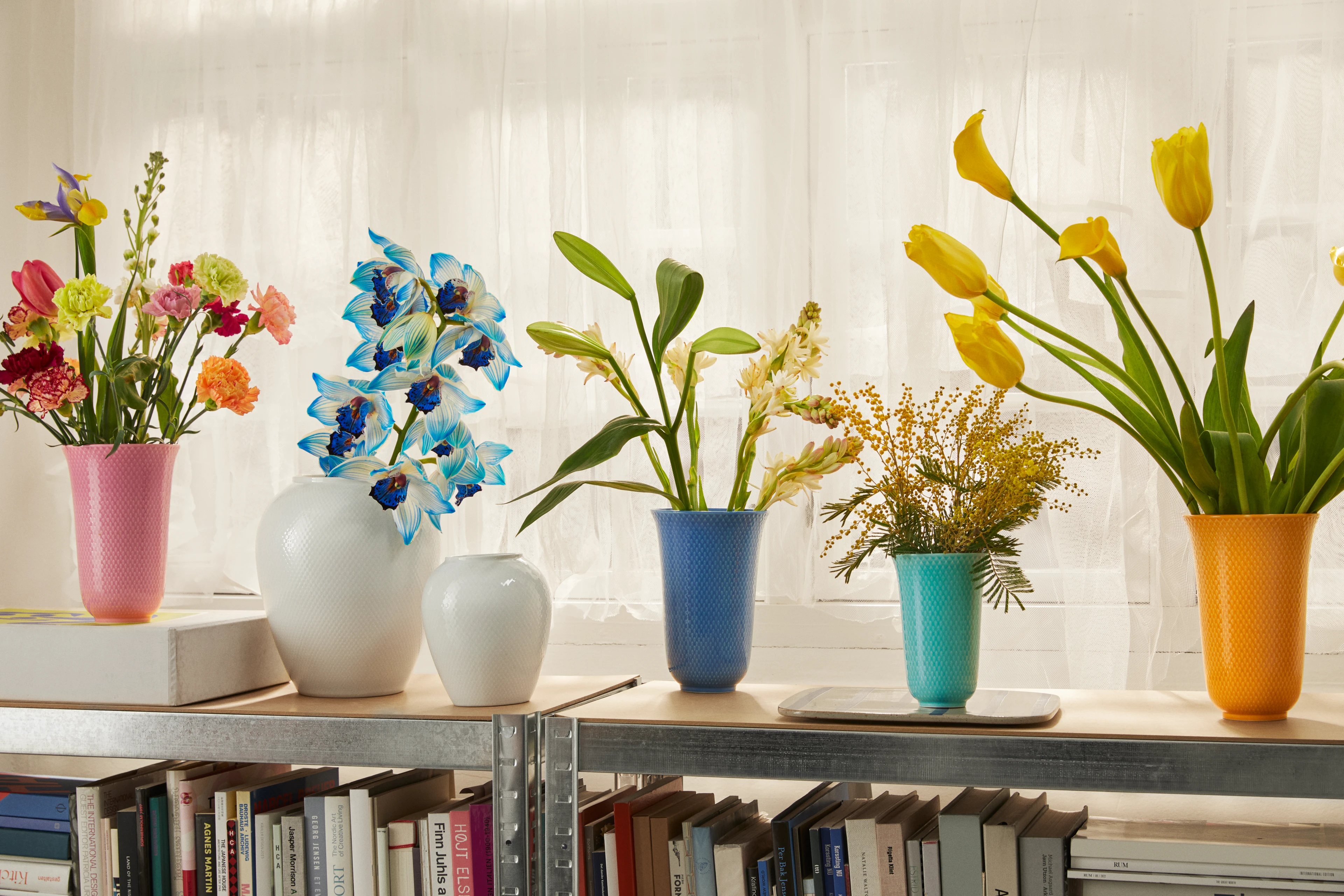
'You should feel free to play with the entire Rhombe Color rainbow'
Exotic colours and strong contrasts. A colour palette that goes well with food, and where all the colours interact and can be mixed and matched.
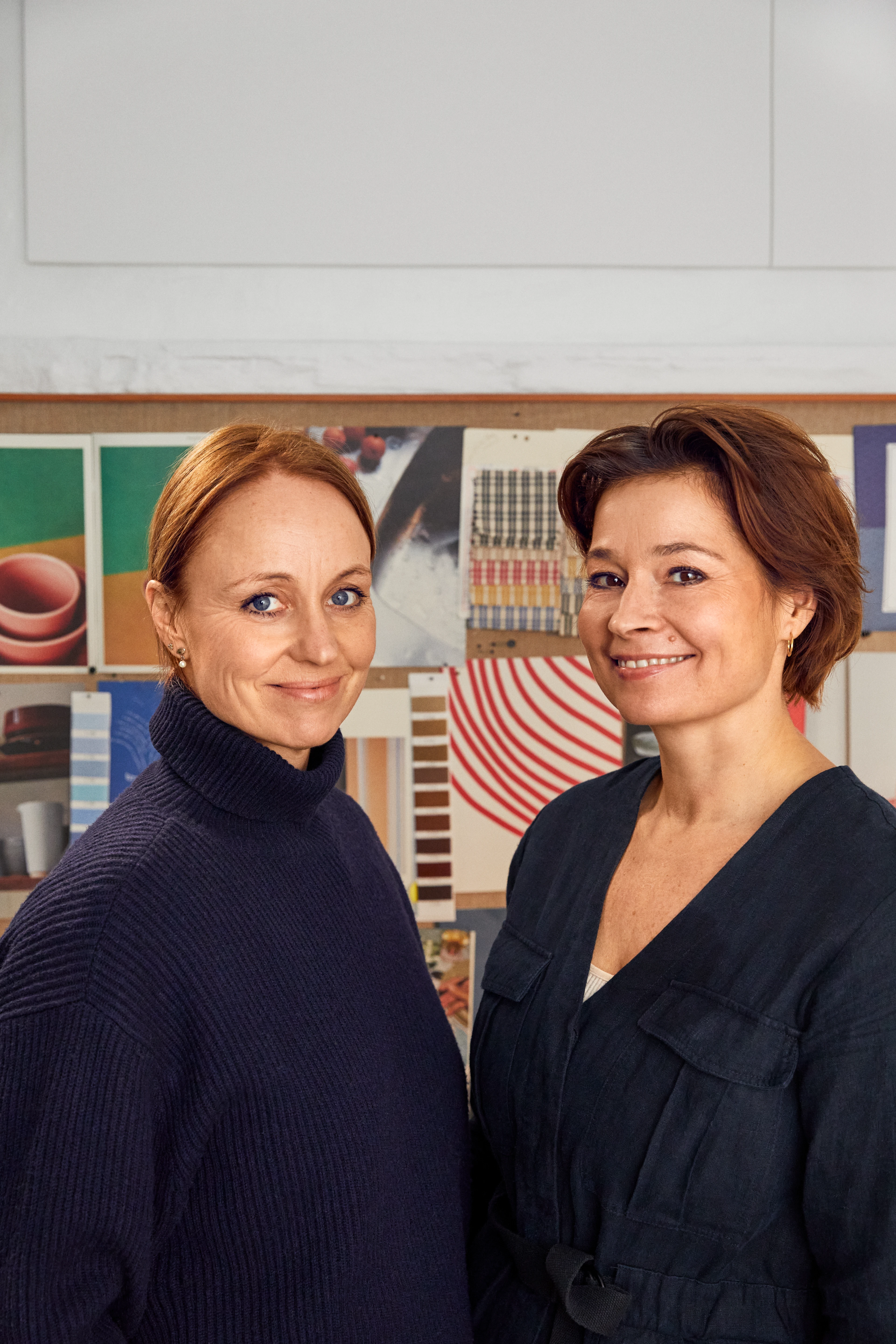
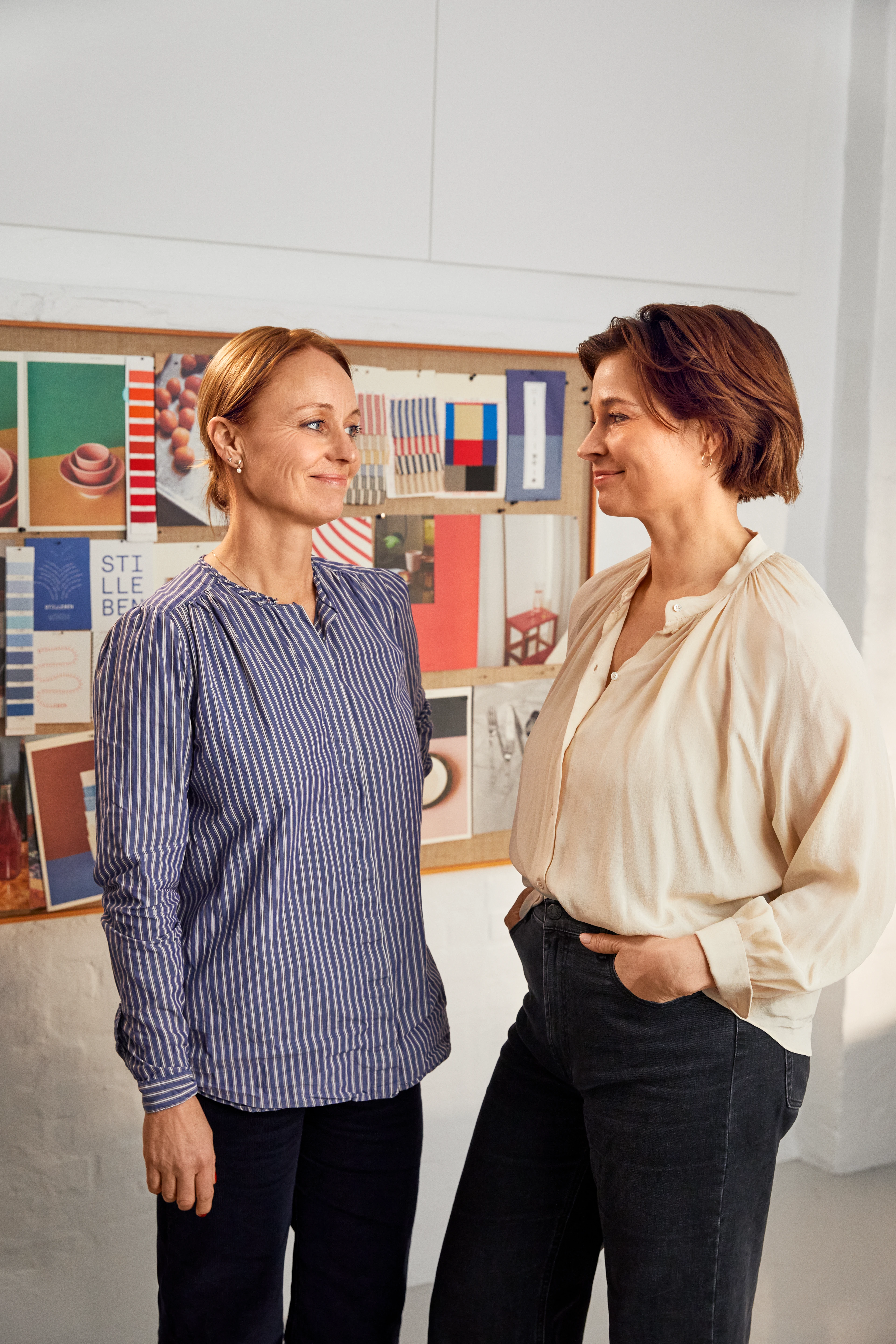
This is the recipe from Stilleben, Ditte Reckweg and Jelena Schou Nordentoft, who are the design duo behind one of Lyngby Porcelæn’s greatest successes in recent years: Rhombe Color. That Stilleben, in collaboration with Lyngby Porcelæn, were tasked with creating the Rhombe Color design and selecting the colours was no coincidence.
Simple and original
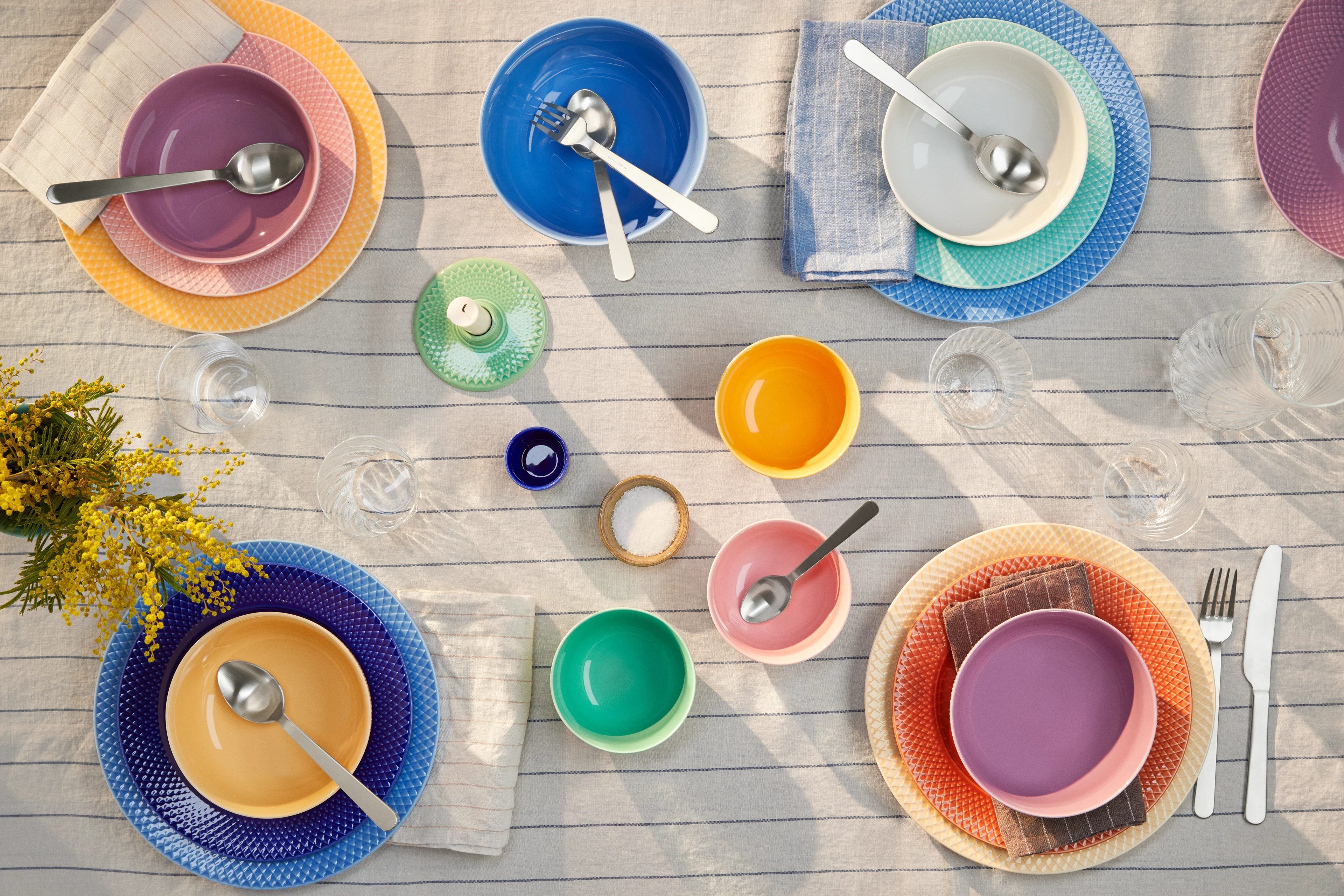
"Early on in the process, we worked on developing Rhombe Color on the basis of a dogma that, when you set a table and incorporated different parts of the range, it should look like a painting from above. And we discovered that to get the dynamic you often see in a painting, it was important to work with both a cold and warm colour scale," says Ditte Reckweg, elaborating on another key aspect of her work with Rhombe Color.
"You can't go wrong when setting a table with Rhombe Color. Two colours won't clash if you put them beside one another. Because everything fits together perfectly. All the parts work in a mix and match style. You should be free to play, so that you can always create your own picture, your personal painting, and constantly change the compositions by moving things around and mixing cups, plates, bowls and dishes – so that every time you place different pieces around the table and on top of each other, you're developing the image."
- Jelena Schou Nordentoft
Inspiration from South America and Mexico
Stilleben has typically found inspiration for the colours in their daily lives – from visits to friends and family, from art and architecture – or possibly most of all, during trips to other cultures and from other ways of living. The different types of food, and the many other expressions of colour, have certainly impacted the strong and very contrasting shades that characterise the Rhombe Color range. Jelena Schou Nordentoft is in no doubt about this, which explains why the composition and matching of colours has been one of their major tasks.
"From the start, we were very aware that we didn't want a colour scale that had a classic Nordic style. We wanted a more intense and rich palette, inspired by the colours you see in South America or Mexico – exotic and strong colours, contrasting tones, which are both intense and grounded in natural shades. All the colours in the Rhombe Color range share the fact that they should have a certain naturalness to them somehow, as you can see from the bright sunflower, sunshine yellows, or the cobalt blue – which are also very classic colours. We’ve also travelled a lot in Japan, where they are insanely good at contrasts, and mixing materials and colours that provide a unique experience when it comes to both food and table settings. All their tiny compositions, right down to the last detail, have been a great source of inspiration in our work," says Jelena Schou Nordentoft, further explaining that it was a difficult balancing act to choose the many strong and contrasting colours, to ensure that they would work well together and feel right with food – while also being very different from each other, and at the same time equally strong.
- Ditte Reckweg
Colour is our language
Explore Lyngby Porcelæn’s design universe
See all StoriesDelivery within 2–5 business days
Free shipping on orders from € 89
30-day
return policyGet your gifts beautifully wrapped
We preserve and develop Danish design icons so that both present and future products can be part of the brands that have helped create our Danish design culture.
